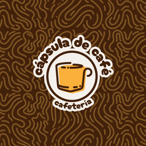
Cápsula de café
For the local coffee shop “Cápsula de Café” (coffee capsule), my creative process began by building on existing brand elements, including the shop’s name and its established physical presence. From the outset, I aimed to create a warm and inviting atmosphere, mindful that the store is located within the “Unidad Médica Onco-Hematológica”, a specialized cancer and hematology medical facility.
Considering this context, the primary audience comprises patients and their families, as well as medical staff such as doctors and nurses. This understanding guided the development of a graphic concept that emphasizes friendliness and comfort, positioning the brand as a welcoming space where visitors can enjoy a coffee in a relaxed, unhurried setting while waiting for consultations or procedures.
“
A graphic concept that emphasizes friendliness and comfort, positioning the brand as a welcoming space


For the logotype design, I synthesized the core concepts of the brand’s name into a recognizable symbol, maintaining a minimalistic and clean line style. This approach allowed me to create an iconic and easily identifiable graphic that remains consistent across different elements. For the color scheme, I selected two primary colors already present in the physical store, ensuring inherent visual consistency, complemented by two secondary colors for additional applications.


Once the primary brand identity was established, I developed a range of graphic elements for various applications, including both printed and digital food menus. I created patterns and textures tailored for specific uses such as social media posts and stationery. Additionally, I designed two characters inspired by the coffee shop owner’s pets, intended for digital applications like social media content and delivery platform materials, adding a warm and personal touch that aligns with the brand’s context.
Related projects
| Branding