Resonancia Arquitectura
For “Resonancia Arquitectura”, I developed a conceptual design inspired by their architectural practice. From the beginning, a sharp eye for detail guided the brand development, which included editorial and web design.
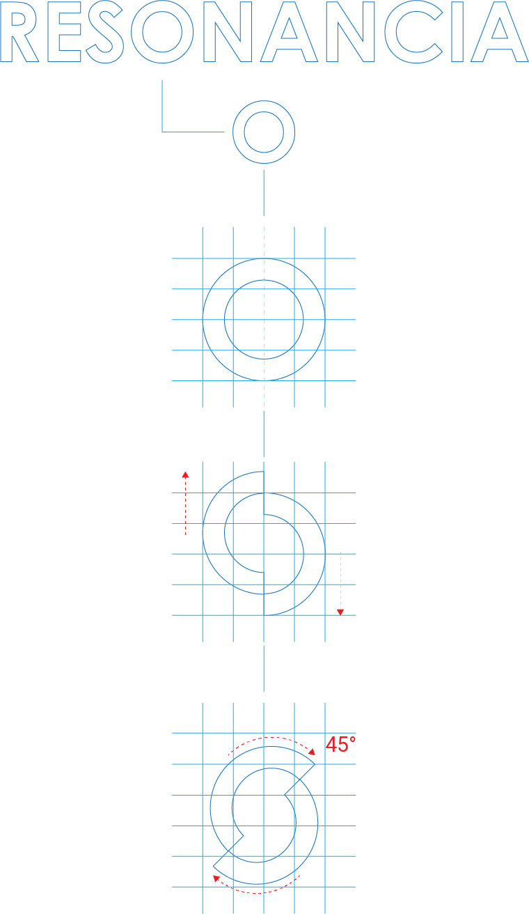
The “Resonancia Arquitectura” logo is rooted in the visual representation of the concept of resonance — understood as the quality of a sound that is deep, full, and reverberating. This idea takes form as a divided soundwave, symbolizing how architectural work projects itself through space and time. It reflects the notion of a perpetual idea put in service of designing and building personal spaces that endure both physically and conceptually.


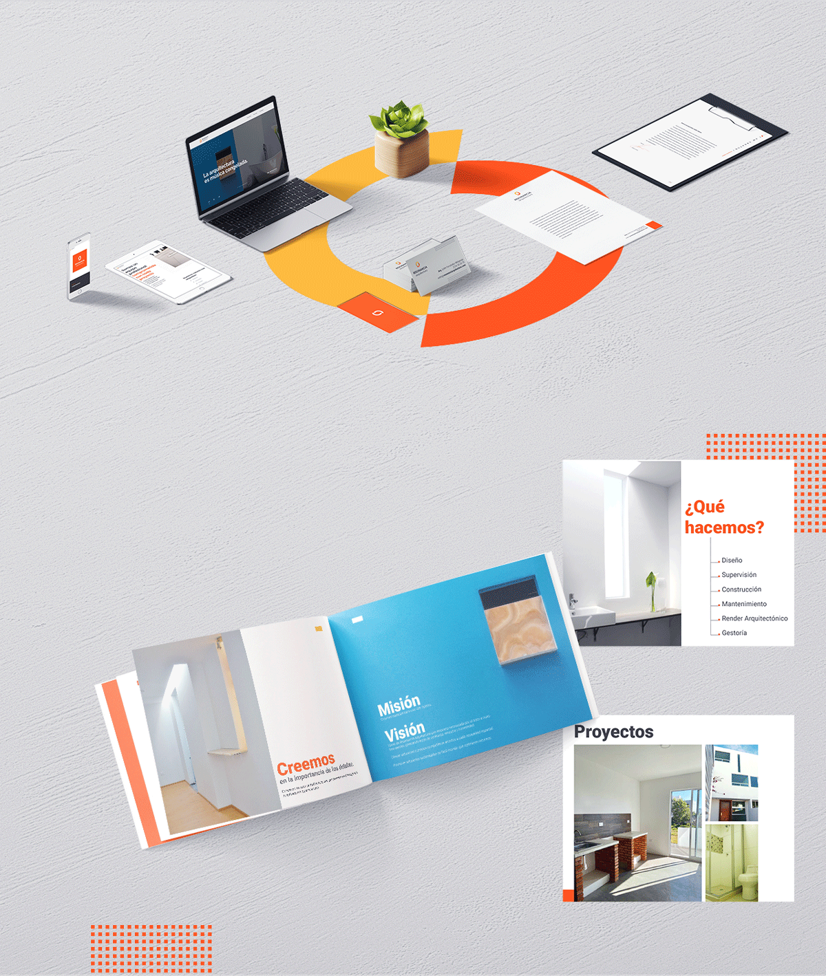
As part of this project, I was responsible for developing the brand’s stationery, website, and a comprehensive brand brief tailored for both digital and printed media. Every element was carefully crafted to align with the core conceptual framework established by the name and logo design. This approach ensured coherence across all touchpoints of the brand’s identity and visual communication.
The stationery—comprising business cards, letterheads, and presentation templates—was designed to reflect the brand’s refined and architectural aesthetic, with attention to detail in layout, typography, and material selection. The website translated the brand’s essence into a functional digital space, balancing clean design with intuitive navigation to offer a seamless user experience. Meanwhile, the brand brief served as a strategic guide for the brand’s tone, visual language, and application in various contexts, maintaining consistency in both online and offline communication.
By aligning all visual and editorial assets with the resonance concept behind the name, the brand identity becomes not only recognizable but also conceptually solid—extending the idea of thoughtful design across every medium.
The “resonancia arquitectura” website can be visited through: https://resonanciarquitectura.com
.